
(Published on Bolseando2 in Spanish, April 2010)
On dshort.com there are some very interesting long-term charts of the S&P 500.
Let’s look at the following chart, which shows the performance of the S&P 500 from 1870 to 2010, both in nominal terms (the index value you can find on many websites) and in “real” terms, i.e., adjusted for inflation. It also provides charts for the “total” value, taking into account the dividends received over those years, assuming they were reinvested.
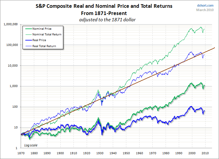
All of them are interesting, but let’s focus on the one where I’ve added a regression line.
This is the “real total return” chart, showing the stock market’s growth including dividends and adjusted for inflation. We can see that from 1870 to 2010, the line rises from about 4.5 to roughly 45,000, if the year ended on the regression line. This means that one dollar of purchasing power invested in the stock market in 1870 would now be worth $10,000 in today’s purchasing power. A remarkable result for the stock market, which can encourage long-term investing, thinking ahead to grandchildren or great-grandchildren.
A simple calculation shows that this represents an annual growth of 6.8%, but keep in mind that this is inflation-adjusted, meaning that the stock market has consistently increased about 6.5% above inflation over the long term. Of course, this comes with large fluctuations, as it is quite common for the market to be double or half of the value corresponding to the regression line.
As of now (April 2010), the S&P 500 is approximately 25% below the regression line.
Place your bets!
[Vía: bolseando2 Mercado bursatil e inflación]
Related posts:
 Real total SP500 in the very long term, updated 2023
 Comparing 20 years of stocks, oil, pension plans, housing and gold
 The roller coaster ride of total returns on the S&P 500! (Updated to October 2025)
 Expropiation of Repsol, what Argentina seeks
 The Warren Buffet portfolio
 Elliott waves
About productivity in Spain and other European countries
The Money and money creation
Elliott waves
About productivity in Spain and other European countries
The Money and money creation