The roller coaster ride of total returns on the S&P 500! (Updated to October 2025)

The roller coaster ride of total returns on the S&P 500! (Updated to October 2025)

  • November 17, 2025
    The roller coaster ride of total returns on the S&P 500! 🎢📈 (Updated to October 2025)

Imagine investing $10,000 in the S&P 500 (with dividends reinvested and adjusted for inflation). How much would you have today depending on when you started?

Last 5 years: +73.84% → $17,384 (actual annualized return: 11.11%)
Last 10 years: +203.65% → $30,365 (11.16% annualized)
Last 15 years: +449.02% → $54,902 (11.41% annualized) ← the best horizon right now!
Last 20 years: +432.45% → $53,245 (8.39% annualized)
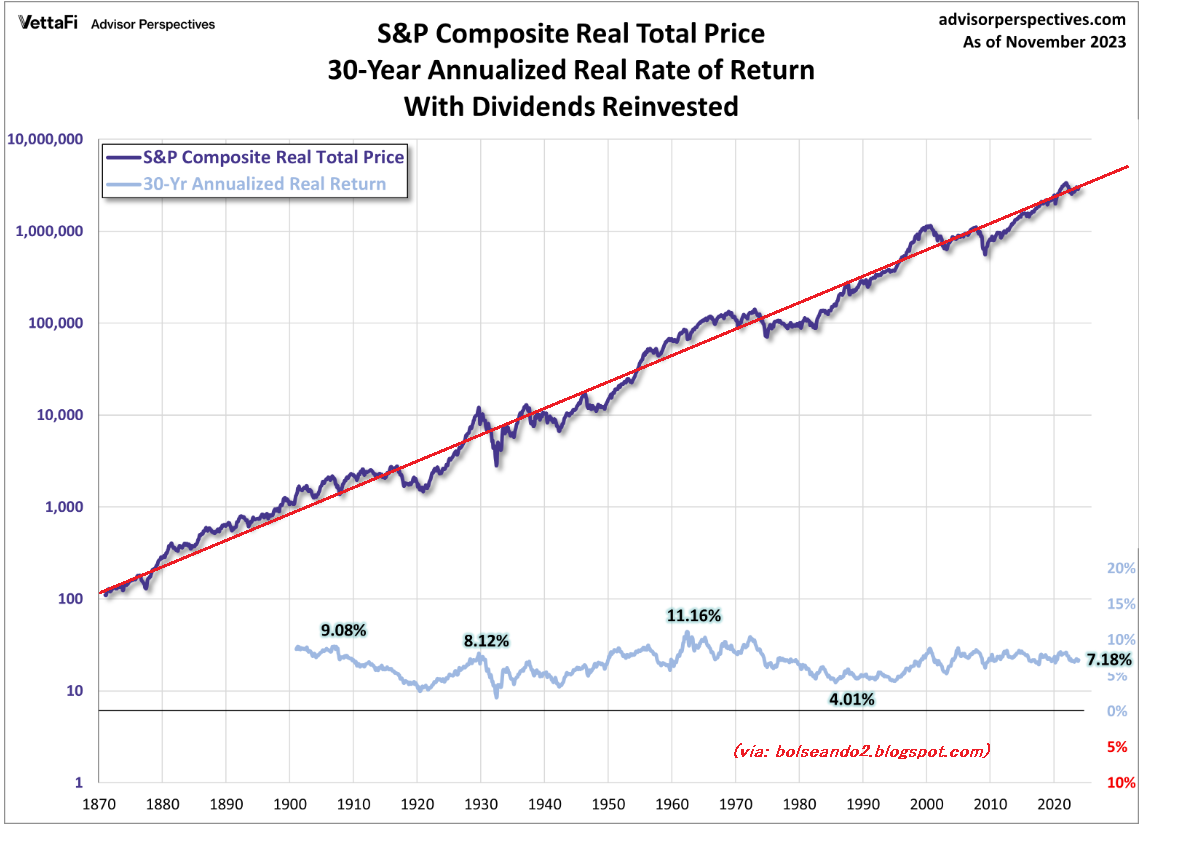
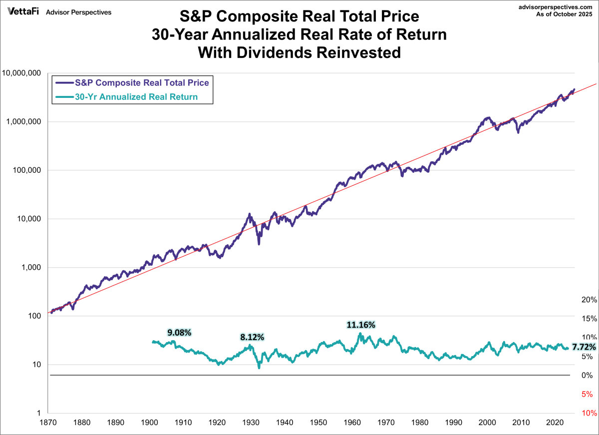
Last 30 years: +906.19% → $100,619 (7.72% annualized)
The longer the term, the less crazy the ups and downs are… but beware: if we had asked this same question in March 2009 (the bottom of the financial crisis), those same 5 years would have left you with only $6,654 in real purchasing power (-8.12% annualized). You would lose a third of the real value!

Continue reading “The roller coaster ride of total returns on the S&P 500! (Updated to October 2025)”

Real total SP500 in the very long term, updated 2023

Back in 2010, 2012, 2017, and 2022, I posted some charts here of the “real” S&P 500, i.e., adjusted for inflation, in a semi-logarithmic chart, covering a very long term (since 1870).
I update the chart as usual with a trend line, chart from advisorperspectives.cm

Back in 2010, 2012, and 2017, I posted some charts here of the “real” S&P 500, i.e., adjusted for inflation, in a semi-logarithmic chart, covering a very long term (since 1870).

Continue reading “Real total SP500 in the very long term, updated 2023”

Expropiation of Repsol, what Argentina seeks

Cristina Kirchner

Argentina —or rather, Cristina Kirchner— has decided on the expropriation of the shares that REPSOL holds in YPF. Or at least almost all of them, since she is taking 51% of YPF out of the 57% that REPSOL owned.

But can we really call this an “expropriation”? Or is it simply a theft?

Why exactly 51% from REPSOL? Why not prorated among all shareholders?

Only one shareholder is being expropriated. This is nothing more than an attack against that specific shareholder —perhaps simply for being a Spanish company? It certainly looks very much like an attack against Spain itself.

The price REPSOL paid for all of YPF was around 13 billion euros. Now, on the stock market, YPF is worth less than 6 billion euros, after the declines caused by rumors of expropriation and the withdrawal of operating concessions —although at the beginning of the year, it was worth twice as much.

So one could say that its market value lies somewhere between 6 and 12 billion euros, more likely around the 12 billion euros it was worth in January 2012.
What valuation will the Argentinians use to determine the “fair price” for the expropriation?

I fear the outcome will lead us to conclude that what Argentina really intends is simply a theft from REPSOL.

[Vía: bolseando, Argentina y REPSOL]

Elliott waves

The Elliott Wave Theory was discovered in the late 1920s by Ralph Nelson Elliott. He found that the stock market does not behave chaotically, but rather in repetitive cycles, reflecting human actions and emotions, largely driven by mass psychology, which he considered the main culprit.

His work was partly based on the Dow Theory, which also uses waves to study the stock market. However, Elliott discovered the fractal nature of the market —the same patterns repeating on larger and smaller scales— and, after years of in-depth study, he identified patterns suitable for making predictions.

From the 1970s onward, the theory gained popularity thanks to the successful predictions of booms and crashes made by Frost and Prechter (“Elliott Wave Principle: Key to Stock Market Profits,” 1978).

Continue reading “Elliott waves”

Comparing 20 years of stocks, oil, pension plans, housing and gold

Let’s take a look at a comparison of 20 investment products, analyzing their performance over the last 20 years, that is, from July 1990 to July 2010. The comparison is very interesting, with oil investment coming out as the winner with an annual gain of 7.09%, and Japanese stock market investment as the loser with an annual loss of 5.72%. Here’s the summary:

MAIN ASSETS
Profitability
Brent
7,09%
Emerging RV
7,02%
RV Spain
6,76%
RV USA
6,61%
RF credits USA
6,21%
RV Alemania
5,99%
Gold
5,94%
RF rental eurozone
5,90%
Mixed RV pension plan
5,72%
Spanish housing
5,32%
RF pension plan credits
5,26%
Mixed RF pension plan
5,11%
RF p USA
5,03%
RF p eurozone
5,03%
Plan pension RF p
4,96%
RV United Kingdom
4,10%
Inflation in Spain
3,37%
RV France
3,13%
RV pension plan
2,17%
RV Japan
-5,72%
Annualized data (performance July 1990 – July 2010)

The evolution of the stock market in the long term, and inflation

(Published on Bolseando2 in Spanish, April 2010)

On dshort.com there are some very interesting long-term charts of the S&P 500.

Let’s look at the following chart, which shows the performance of the S&P 500 from 1870 to 2010, both in nominal terms (the index value you can find on many websites) and in “real” terms, i.e., adjusted for inflation. It also provides charts for the “total” value, taking into account the dividends received over those years, assuming they were reinvested.

Continue reading “The evolution of the stock market in the long term, and inflation”